People usually respond better to such visuals that tell a story

“Clutter and confusion are not attributes of data – they are shortcomings of design.” – Edward Tufte
So, what is data visualisation?
Well, data visualisation is a coherent way to communicate quantitative content visually. Depending on its attributes, the data can be represented in various ways, such as pie charts, bar charts, line graphs, scatter plot, or map.
The image below is an excellent example of great data visualisation.

Source: graphics.wsj.com
Data visualisations should be visually appealing, useful, and never misleading.
Hence, web designers must adhere to the best practices in data visualisation and come up with the best way to present the data set visually. Today, most of the web design companies in NYC are implementing the data visualisation best practices to deliver user-engaging designs for their clients.
Why do you need to use data visualisation?
As per IBM, every day, 2.5 quintillion bytes of data are being created.
As the world is becoming more and more connected with a large number of electronic devices, this data volume will continuously grow exponentially. Our human brain is not capable of comprehending all these data without drawing some abstract analogy.
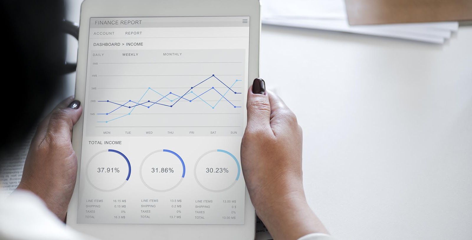
Image Source: Toptal
Big data becomes useless if it cannot be consumed and comprehended in a meaningful and useful way. This is why data visualisation has become so important not only in web design techniques but also in economics, science, services related to healthcare, and many more.
Here is a list of 5 data visualisation best practices in web design:
1. Know your audience
The first and foremost step to create an impressive data visualisation is to have a clear idea of what you want to say and who your target audience is.
You need to have a clear idea of what kind of questions your target audience cares about and what kind of answers your data visualisation is delivering to them. Not everyone processes data in the same way. Hence, defining a clear purpose through data visualisation is crucial.
For instance, a sales manager and a chief financial officer have different perspectives to understand profitability on a probability dashboard.
Hence, to create the perfect data visualisation, you need to make sure that you know your target audience well and accordingly design data visualization to which your audience can relate the most.
2. Show data using visual features
A variety of charts like line charts, bar charts, pie charts, scatter plots, etc. are available to present data in the best way.
Here’s an example of using bar charts.

Source: Our World in Data
Now, which chart to use where entirely depends on the expertise of the designer’s artistic and creative mind! The right chart will not only make the data easy-to-understand but also present it in the most accurate light.
Well, to make the right choice of visual feature, you need to consider what type of data you are conveying and who your target audience is.
3. Use visual hierarchy and messaging and create a narrative flow
The best-in-class data visualisations can tell intriguing stories. These stories can turn raw data into useful information. Now, these stories can emerge from outliners, correlations, or trends in the data.
If you are thinking that data visualisation is all about showing numbers only then you are wrong! How can you tell a great story without words? Here comes the utilisation of messaging. With the right visual hierarchy, you can guide the reader step by step through the data.
Also Read: The big data heroes of today: citizen data scientists
4. Label data points directly
To make it easily understandable what an optical element is representing, it is essential to label it.
Many designers use labels to tell the readers which colours or which symbols are representing what in the charts. However, it puts an unnecessary strain on the readers’ eyes and minds as they are forced to look back and forth between the data and the labels.
As a better alternative, you can label the data points directly on the chart.
Yes, sometimes it is a bit challenging for the designer, but being able to overcome the challenge is the key to success for a skilled and creative designer! You can’t let your readers go through the pain just because you want to skip some extra work.
5. Design iteratively
Data visualisation should be done in such a way that it is not only easily understandable to customers but also can deliver the best results.
To do so, once you get the list of requirements, start with designing the concept proofs along with the prototypes.
Then, evoke feedback in an interactive setting and accordingly, revise it. It is better to avoid analysis paralysis.
Wrapping up
The best data visualisations communicate a data set effectively and clearly by using graphics. It creates an engaged, data-driven business culture.
To encourage this encouragement further, you can send scheduled email reports and metric-driven notifications.
Also Read: 10 data security predictions by Gartner for the year 2020
Understanding your corporate culture, your audience, along with human nature as a whole, is the key to proper data visualisation.
–
Editor’s note: e27 publishes relevant guest contributions from the community. Share your honest opinions and expert knowledge by submitting your content here.
Join our e27 Telegram group here or our e27 contributor Facebook page here.
Image Credit: Luke Chesser
The post 5 best practices for data visualisation in web design for 2019 appeared first on e27.